Hello lovely people and thanks for stopping by my little creative ‘hub’ on the web. I have a coffee in hand and I’ve been in quite a creative little zone today. I’m excited to be bringing more creative love to everyone.
Today I wanted to come and share something fun I have been trying. I pulled out some of my favourite new Designer Series Paper and took some of my stamps and tried some stamping on Designer Series Paper. This is a great way to change up the look of your Designer Series Paper and make it look completely different!
I wanted to include a little look at the two particular patterns of Designer Series Paper that I used because you may not realise just what collection they come from looking at the cards…
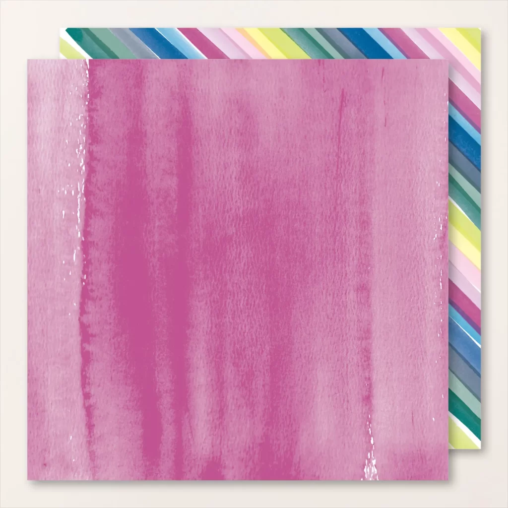

When you look at the Bright & Beautiful Designer Series Paper as a whole collection you might see party, bright and bold colours – but when you tone it down and look at each pattern individually they can be quite muted and soft with these beautiful watercolored tones. That is the look I went for on these two cards.
A brief summary of the two two techniques when it came to using the Designer Series Paper on these two cards.
I stamped right on my Designer Series Paper with ink. TIP ONE: Don’t be afraid of stamping right on top of your Designer Series Paper, it adds texture and tone.
I also took a Blending Brush and added even more colour to the edges to create a bit of a Vignette look. TIP TWO: Adding dark blending to the edges inwards really helps to bring the eyes attention inwards towards the centre focal point.

Here is a look a the first finished card.
I have so much colour going on and I love it! Here’s the basis of the colour combination I used for this card…
The Dainty Delight Dies have a lot of pieces but they are so worth it!
I put my favourite music mix on and went to town die cutting away. I love a bit of a music mix in the craft room a good die cutting session is not something that bothers me!
I also used the gorgeous stamps to stamp and colour one of the large floral stamps and colour in a mixture of blues and greens with the Stampin’ Blends – this even comes with a coordinating die! Easy!

Here is a close up of the finished card so you can see some of the detail.
I did sneak in some Starry Sky as I have stamped right on the background with one of the coordinating stamps and spritzed the background with the Starry Sky Stampin’ Write marker.
To add a ‘base’ for my focal point I used the Radiating Stitches dies and some of the Vellum Basics Specialty Paper (this stuff is gorgeous – if you haven’t got some – you need some)
To embellish I have added some Essentials Bakers Twine and some Neutrals Sequins. These are such great embellishments to add to an order as they are both basics that can coordinate with any design!

I added a simple inside with some Pool Party with a Blending Brush, another stamped element which I have coloured with a Wild Wheat Stampin’ Blend and some of that gorgeous left over Designer Series Paper.
I spritzed some more of the Stampin’ Write marker to help it coordinate with the card front.

Here is a look at the second card that I made. Whoah look at that pink!
Isn’t Berry Burst Amazing!?? I am so glad that it made a return!
Here is a look at the colour combination for card two…
I have repeated the exact same design for this card except used a few different colour choices to change it up a little bit.

Here is a close up of the finished card.
I chose to use the same sentiment on both cards which I have actually used Versamark and heat embossed in black as I just love the bold and vivid black look that this gives a sentiment.
I did choose to also add some extra Fresh Freesia to my die cut flowers with a Blending Brush a little Fresh Freesia ink for a little extra depth. This is a great way to add extra depth and tone when you feel like something is looking a little ‘flat’.

Here is a look at the inside of my second card which I have also kept exactly the same apart from using a different stamped and die cut image which I have coloured. I added some Berry Burst ink with Blending Brush and some light spritzing with a marker.
I really enjoyed. making these two cards and playing with some colouring techniques, bright colours and also altering Designer Series Paper.
It’s always fun to give some of your ‘older’ products a fresh face and don’t forget about them and leave them on a shelf.
I know that is something that I am trying to not do as much!
I hope that you got some inspiration from my card shares today. Stamping on your designer series paper is fun and I really urge you to give it a try! If it is something new, try doing it tone on tone, it’s subtle and a good way to give it a try!
I’d love to see what you do – feel free to share it with me over on my Facebook here.
Until next time, crafty hugs. xx
SHOP WITH ME & GET A FREE GIFT & TUTORIAL
PLEASE NOTE: Regardless of when you are viewing this post, this is automatically updated so the information and links listed here are current.
Shop with me in May 2026 to receive a FREE gift, tutorial and handmade card from me to thank you for your order.


Don’t live in Australia but still want to purchase the tutorial? You can purchase it through my tutorial store for $22AUD for instant PDF download. CLICK HERE to purchase.
HAPPENING NOW
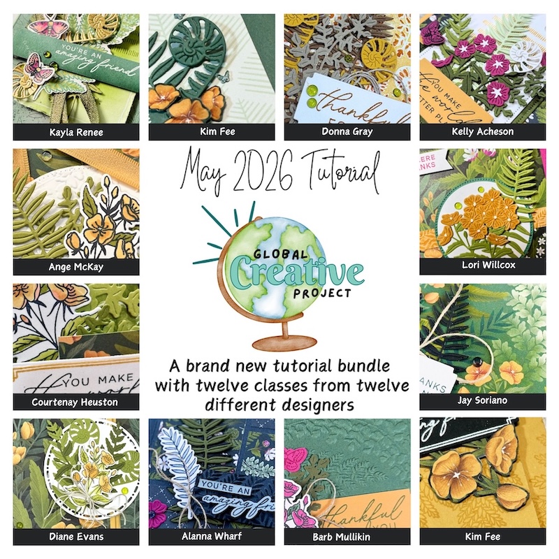
The brand new May Global Creative Project tutorial is now out. Earn for free from me for placing an order in my online store or head to my tutorial store and purchase the PDF tutorial.
New Creativity Kits have been released in my online store. Head here to check them out.
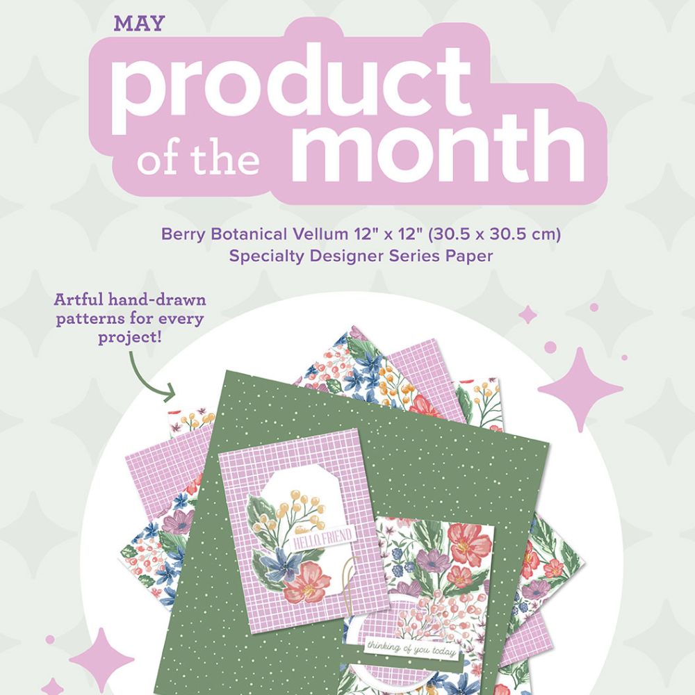
Our new Product of the Month promotion is now in full swing. Get an exclusive product for just $9 when you spend over $125 in my online store. Learn more about this new program here.
upcoming events
I have so much fun at The Stamping Lounge which is run by myself, Maheswari Rajaguru and Rochelle Laird-Smith.
We not only have a monthly membership full of amazing content but we also run regular classes.
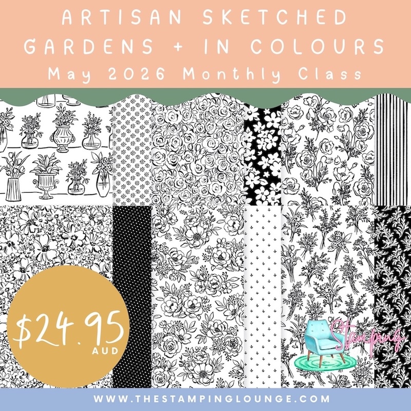
The Artisan Sketched Gardens Monthly Class + In Colours Class is coming up on the 16th of May.
We also have our upcoming Catalogue Launch party which are always a favourite event. You can find out more here.
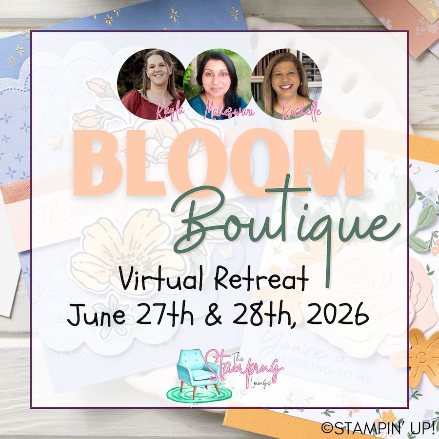
Coming up in June but open for registration NOW is our next fan favourite virtual retreat. You can find out all the details here.
Click the images or links to find out more and enrol OR sign up to The Stamping Lounge membership to get access to monthly classes and more which are included in the membership (retreats are sold separately)
BRAND NEW SKETCH BOX
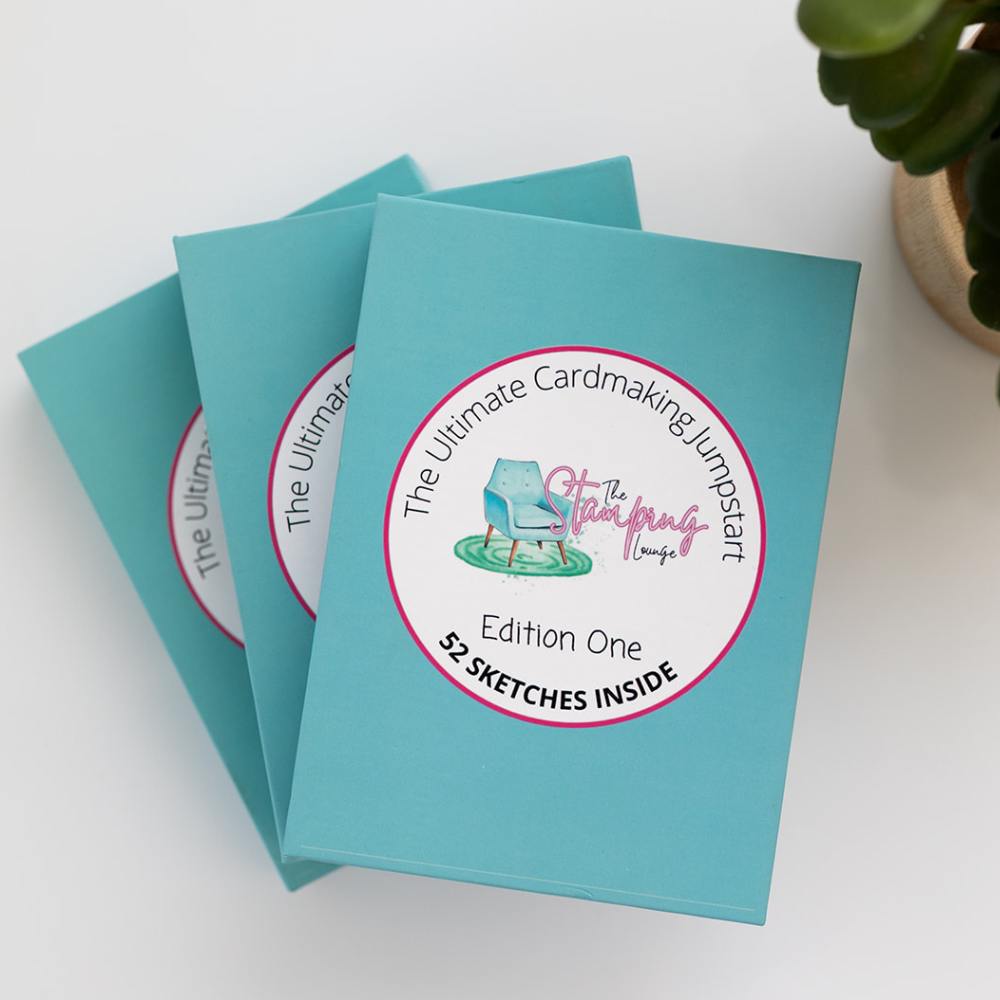
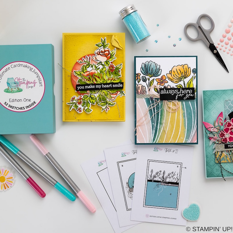
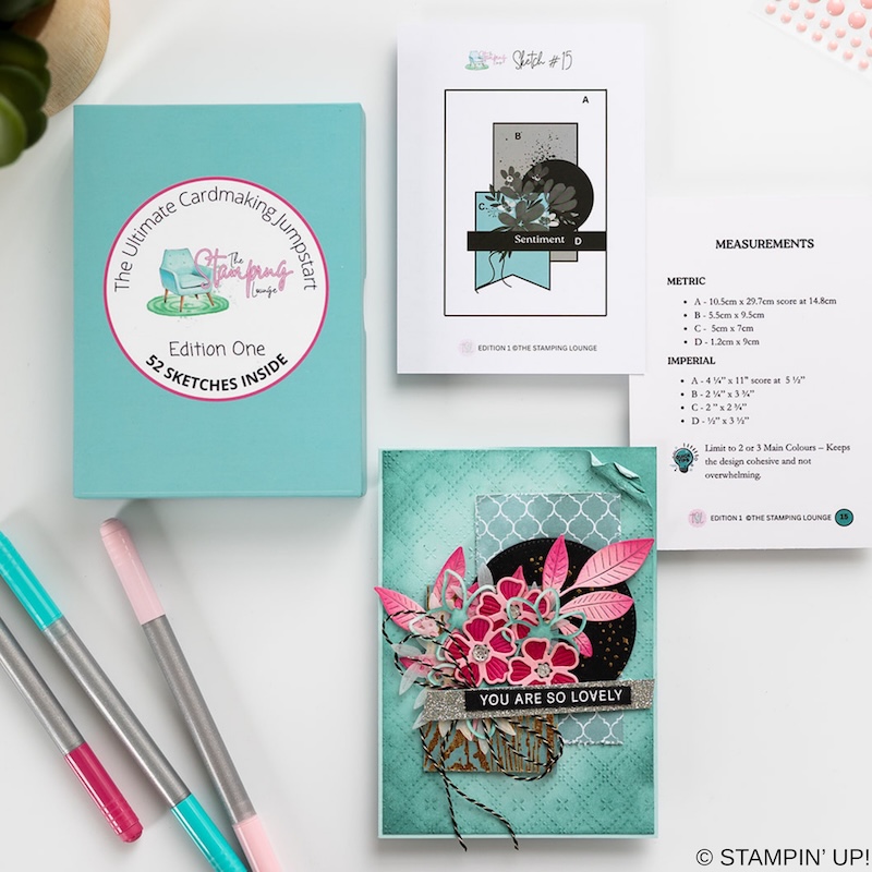
We have a brand new product at The Stamping Lounge and you won’t want to miss this one. Get your sketch box complete with 52 sketch cards that include measurements and crafting tips! This is a tool you need in your crafting tool box that you can use again and again. Available now and shipping internationally. Get yours here.


Leave a Reply