A little bit about colour & Stampin’ Up! BRIGHTS COLOUR COLLECTION
Hands up all those brights colour collection lovers here? Using bright colours in my crafting is definitely a love of mine! In fact if you scroll my website or my Instagram I think you will find that it is a common theme!
I am known for my love of bright colours but then again I think we all have a natural gravitation or sway one way or another towards a trend of colours.
Stampin’ Up! provides well in this regard with ‘families’ of colours with a brights colour family, regals colour family, subtles colour family and neutrals colour family.
Stampin’ Up! also regularly introduces what they call In Colours which are periodical releases that stick around for two years and are ‘limited edition’ releases and are refreshed every two years.
I think this reinforces my love that Stampin’ Up! has the market trends in their best interests – they keep it fresh, fun, interesting and current.
My post today however is sharing everything about the bright colour family since that is my love and I have made a project (yes another one!) celebrating that colour family!
I am actually participating in a fun Instagram Hop and the whole theme (hence this fun post) was to feature a project based around our favourite colour family. How fun is that?
I have a feeling you are going to see a lot of brights *wink*
Here is a look at the colours featured in the Brights Colour Family


HEAD TO MY INSTAGRAM HERE TO SEE THE WHOLE HOP
Can you guess my FAVOURITE bright colour?
I actually have TWO! Yes I know. I just couldn’t let my heart decide between the two. Coastal Cabana and Lemon Lime Twist are my two favourites. In fact I have quite often made a card featuring both colours together. It reminds me of the childhood saying, “Blue and green must not be seen, unless there is a colour in between.” What a fallacy. I love them together!

JUst a little more about colour
If you want to see all the colour families not just the Stampin’ Up! Brights collection and see how you can purchase the ink pads, the cardstock, the pens etc all in easily bundled packs…or see just what amazing colours are in each collection – head to my store here where this page will show you each colour family.

Here is a look at my finished card.
I was actually inspired to make the easel/chalkboard by the lovely Verena Shapiro from the Artisan Design Team with a lovely card she shared where she made the easel into a chalkboard.
You can see her card here
I decided to take it a little step further and turn my easel into a shaker card! The easel does come with a coordinating die, however it does not cut out the centre, so I have taken a scalpel/craft knife…did you know that the Take Your Pick tool now has this attachment?

Purchase The Take Your Pick Crafter Tips Here
These attach right onto the original Take Your Pick tool. AMAZING!
I cut out the centre of the easel, added some Window Sheet using a strong adhesive (I used Tear N’ Tape) and added the Adhesive Foam Strips. I used Verena’s amazing idea of using the Painted Texture 3D Embossing Folder background which I have lightly added some white ink to for the chalkboard effect.
My shaker card is filled with some of the cute spools of thread in the bright colours, some die cut hearts and some sequins. CUTE!
You can use a variety off things to fill a shaker card – think small die cut pieces, sequins, tiny beads, glitter etc…
Stampin’ Up! have lots of options.
Head to the embellishment section of my Stampin’ Up! store to browse Shaker Card options here.

Here is a close up look at my finished card.
I have really tried to space out my bright colours and continue to add them through the card as I really wanted to show that I was featuring the Bright Colour Collection.
I used that cute little ruler die as a bit of a feature by cutting it in each of the brights colours and adhering them in strips down my background. I love how that turned out!
I added a few finishing touches with some spritzing with a Lemon Lime Twist Stampin’ Write Marker, some Linen Thread and some left over die cut pieces!

Here is a look at the inside of my card where I have added some left over pieces to bring through the card front elements to follow through the design.
I often like to do this on my card designs, not only as a design element but also because I spend so much time on a card front that I really want to make the inside pretty too!
I hope that you were able to get some inspiration from my project share today. I’d love to know what your favourite colour family is. Maybe you are a fan of the brights colour collection like me, or maybe you are a bit more of a subtle or regal fan. Do leave me a comment and let me know.
Until next time, crafty hugs. xx
SHOP WITH ME & GET A FREE GIFT & TUTORIAL
PLEASE NOTE: Regardless of when you are viewing this post, this is automatically updated so the information and links listed here are current.
Shop with me in July 2026 to receive a FREE gift, tutorial and handmade card from me to thank you for your order.


Don’t live in Australia but still want to purchase the tutorial? You can purchase it through my tutorial store for $22AUD for instant PDF download. CLICK HERE to purchase.
HAPPENING NOW
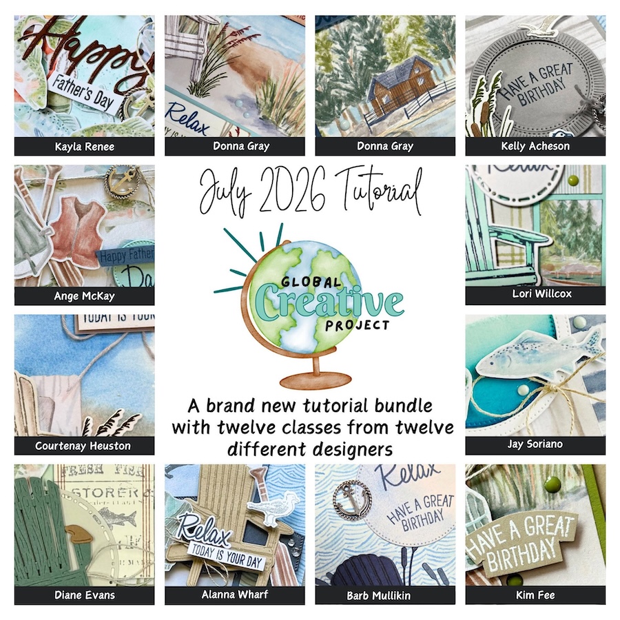
The brand new July Global Creative Project tutorial is now out. Earn for free from me for placing an order in my online store or head to my tutorial store and purchase the PDF tutorial.
New Creativity Kits have been released in my online store. Head here to check them out.
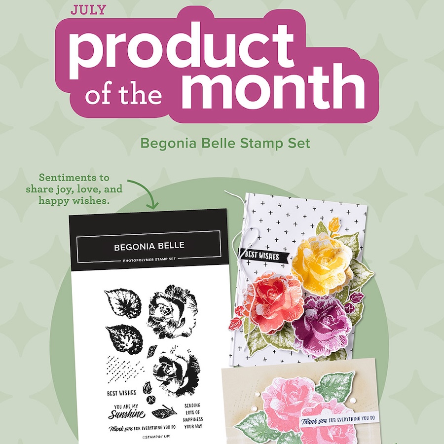
Our new Product of the Month promotion is now in full swing. Get an exclusive product for just $9 when you spend over $125 in my online store. Learn more about this new program here.
upcoming events + KITS
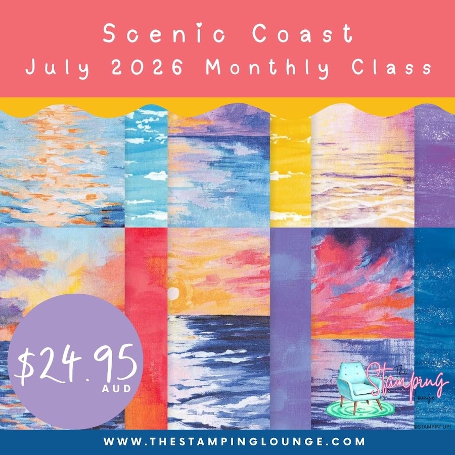
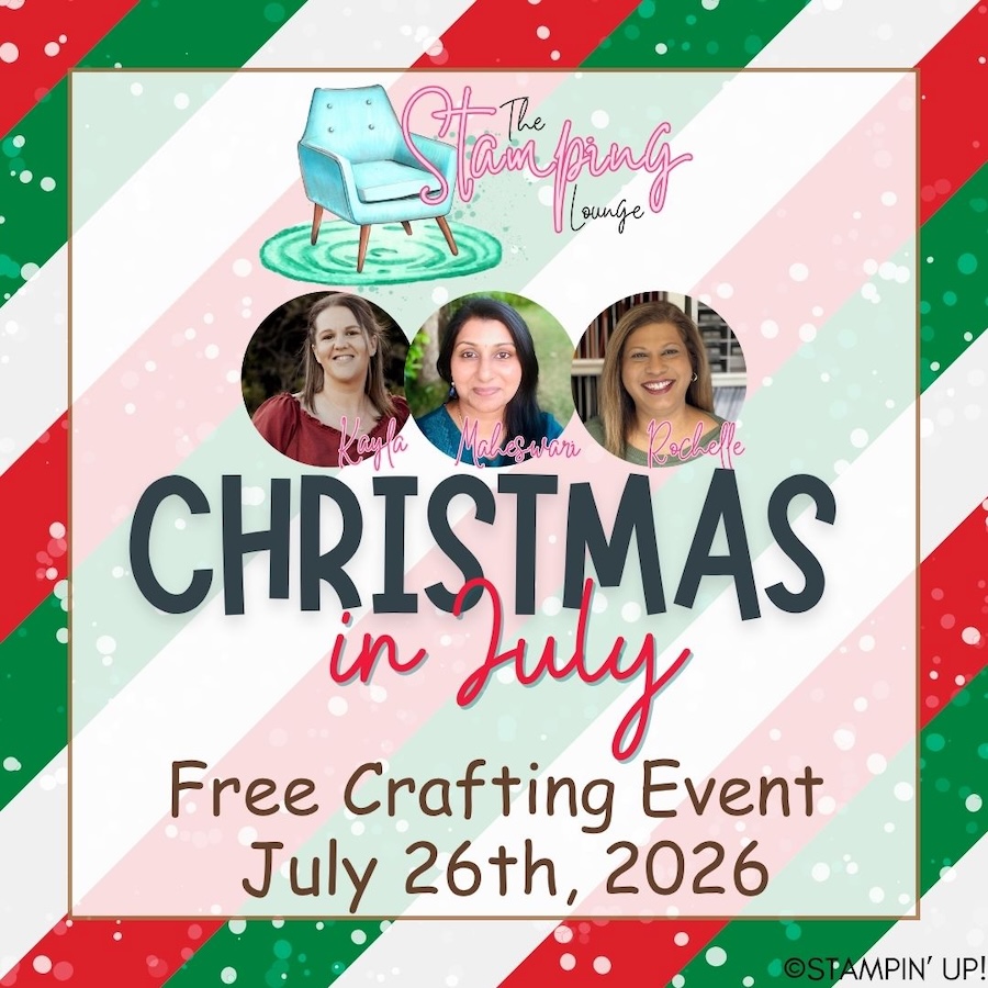
I have so much fun at The Stamping Lounge which is run by myself, Maheswari Rajaguru and Rochelle Laird-Smith.
We not only have a monthly membership full of amazing content but we also run regular classes.
The Scenic Coast Monthly Class is coming up on the 18th of July.
Also coming up in July and open for registration now is our annual FREE Christmas in July event. Find all the details here.
Click the images or links to find out more and enrol OR sign up to The Stamping Lounge membership to get access to monthly classes and more which are included in the membership (retreats are sold separately)
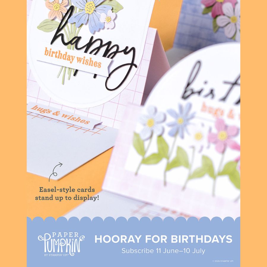
New Paper Pumpkin Kit coming in July – subscribe by the 10th of June to receive the Hooray for Birthdays Kit
PLUS – subscribe to Paper Pumpkin with me and get TWO alternative PDF tutorials with a total of 20 tutorials for projects using this kit. Click here to subscribe with me.
BRAND NEW SKETCH BOX
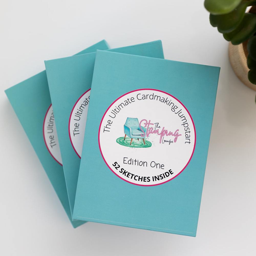
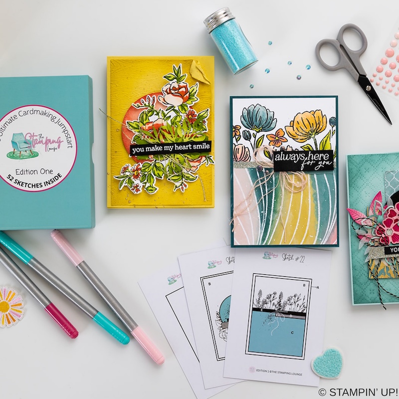
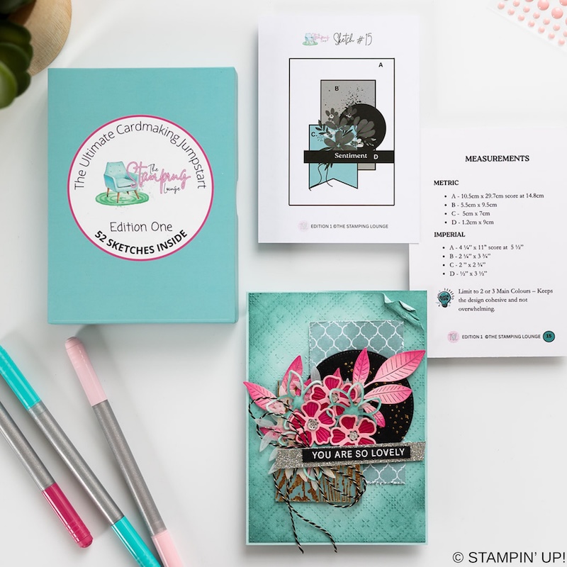
We have a brand new product at The Stamping Lounge and you won’t want to miss this one. Get your sketch box complete with 52 sketch cards that include measurements and crafting tips! This is a tool you need in your crafting tool box that you can use again and again. Available now and shipping internationally. Get yours here.
") |  |  |  | |
 | ||||
 |  |  | ||
 |  |  |  |  |
 |  |  |  |  |
 |  |  |  |  |
 Specialty Paper")


[…] have a look at the chalkboard idea from my card idea here […]